CASE STUDY
8common is a leading Australian SaaS company that provides financial transaction and expense management solutions to large enterprises, governments, and non-profits. Its flagship platforms, Expense8 and CardHero, are used by over 170,000 users across organisations like Woolworths, Amcor, and more than 150 government agencies.
Expense8 is an end-to-end travel and expense management platform with three core modules — Expense Management, Corporate Travel, and Intelligence Reporting. It was recognized as a Major Player in the IDC MarketScape for SaaS Travel & Expense Management.

PROJECT SUMMARY
In 2023, I was brought on as the Lead UI/UX Designer to lead a full-scale redesign of the Expense8 platform, with the goal of:
Solving long-standing UX pain points in the expense approval and review flows
Improving usability, accessibility, and consistency across web and mobile
Unifying the platform with a new design system
Making the platform WCAG 2.1 Level AA compliant
I also contributed design work to CardHero, focusing on fund disbursement workflows, transaction transparency, and real-time compliance UX.
MY ROLE
• Sole UI/UX Designer leading product-wide redesign
• Owned end-to-end process: research, flows, wireframes, prototypes, final UI, design system, dev handoff
• Collaborated with PMs, developers, QA, and internal stakeholders
• Worked fully remotely, using async workflows and collaborative tools
TOOLS: Figma & Jira
TIMELINE: ~8 months (UX Research to Final Handoff)
Despite being powerful under the hood, Expense8’s user experience had not evolved with the needs of modern enterprise users:
RESEARCH
To understand friction points, I analyzed:
• Support tickets and client feedback logs
• Internal team walkthroughs (especially finance/admin roles)
• Usage data on high-friction flows (approvals, rejections, submission errors)
KEY INSIGHTS
• Reviewers and approvers needed summary-level info upfront, not buried in deep layers
• Mobile usage was rising among field staff, yet the product lacked responsive interaction support.
• Users with visual impairments reported contrast issues and confusing navigation without assistive labels.

MAPPING JOURNEYS & REDEFINING FLOWS
• Reconstructed all user journeys for Expense Management and Travel flows
• Simplified approval/rejection/review into linear, focused actions
• Consolidated key data views to reduce clicks and prevent tab switching
WIREFRAMING & PROTOTYPING
• Used FigJam for ideation with stakeholder
• Created low-fi and high-fi wireframes in Figma
• Built prototypes for internal and client testing
DESIGN SYSTEM CREATION
• Designed a new design system from the ground up: colors, typography, components, grids, and spacing
• Integrated accessibility rules (color contrast, keyboard navigation, ARIA labels)
• Set up design tokens aligned with Storybook for developer use
ACCESSIBILITY AUDIT & WCAG COMPLIANCE
• Applied WCAG 2.1 guidelines throughout UI — Level AA
• Introduced alt texts, semantic roles, focus states, and better keyboard/tab support
• Worked closely with QA to validate final builds using accessibility tools
HANDOFF & DEV SUPPORT
• Delivered pixel-perfect specs in Figma
• Worked cross-functionally in agile sprints with devs and QA
• Provided interaction documentation and component usage guidelines via Storybook

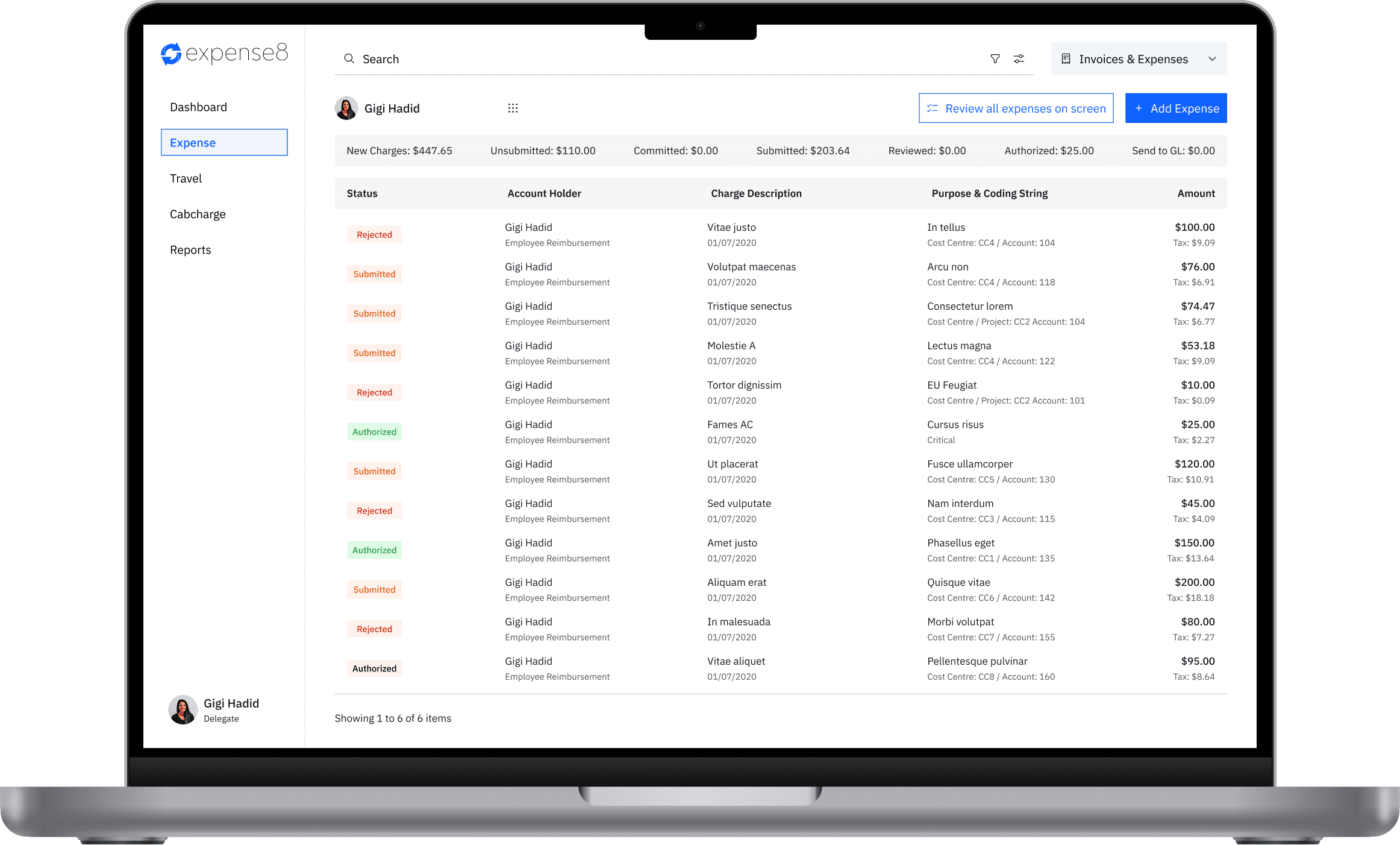
AFTER - SOLUTION
MAPPING JOURNEYS & REDEFINING FLOWS
In parallel, I contributed UX enhancements to CardHero, 8common’s fund disbursement platform for NFPs and government clients:
• Simplified transaction history and audit trail UX for finance teams
• Designed spend control interfaces allowing real-time visibility of rule-triggered card blocks
• Ensured consistent user experience across both platforms (Expense8 + CardHero)

KEY LEARNINGS
• Building a design system from scratch under accessibility constraints requires tight coordination between design and development.
• Government clients demand not just function but accountability, clarity, and inclusivity — which UX plays a central role in delivering.
• In remote-first environments, over-communication and clear documentation are vital for design impact.
FINAL THOUGHTS
Redesigning Expense8 was more than a visual upgrade — it was a strategic overhaul that brought clarity, speed, and inclusivity to a mission-critical government tool. I’m proud of the measurable impact we achieved and the strong design foundation now in place to support future growth.
*The contents of this case study are based on publicly available information and personal contributions that do not disclose any confidential or proprietary data. All insights, outcomes, and visuals shared here reflect my individual design work during my time at 8common, specifically on Expense8 and CardHero, and have been carefully written to respect all non-disclosure obligations. This case study is intended solely for portfolio and professional presentation purposes.